


BACKGROUND
The Seattle SuperSonics, commonly known as the Sonics, were an American professional basketball team based in Seattle. Founded in 1967 as part of the expansion into the Pacific Northwest, they quickly became one of the most successful teams during their four decades. They won three conference titles and one championship while playing with legendary players such as Gary Payton, Shawn Kemp, Ray Allen, and Hall-of-Famers Lenny Wilkens and Fred Brown.
Looking at the history of their brand identity, the primary logo for the team has gone through several changes over its 41-year history, reflecting both changing times and evolving design trends. Though, one element that has been constant to their identity is the green color, which was a huge component and representation of the city.


The SuperSonics name pays homage to the Boeing 2707, a state-of-the-art supersonic transport designed to fly at 2.7 times the speed of sound. The Sonics’ branding gamble paid off and helped establish the team as one of the league’s signature franchises. The Green and Gold became a uniquely recognizable color combination as well.


Despite its rich history, the team would eventually be relocated to another city; thus, leaving the city of Seattle without an NBA team for more than a decade. With rumors circulating about potential plans on having expansion teams, the possibility of bringing professional basketball back to Seattle would bring more excitement to basketball fans, especially when the team would go on a rebrand.
SOLUTION
The rebranding of Sonics must remind basketball fans of its iconic history, bringing back the identity that was once adored yet reestablishing a fresh and timeless detail.
As part of my personal design exercise, I incorporate different sets of logos from primary to tertiary and produce sets of uniforms and courts. The Sonics rebrand also feature an Emerald City Basketball version as part of its City Edition uniform to give prominence to the city.


The primary logo features a basketball in an onward trajectory with visible speed. This was inspired by the '67 and '95 logo as both logos feature an object apparently moving with speed. The basketball feature has also been consistent with the past logos, creating a symbolic emblem for the Sonics brand. As for the speed element, it also resembles an S letter designed subtly to pay homage to Seattle and to embody the SuperSonics initials (SS).


The secondary logo (refer to the image on the left) is reminiscent of the rich history of Seattle Sonics Basketball, featuring the silhouette of Space Needle which had been present as an element to the past logos. Also, a subtle S on the negative space is designed to resemble the lines of a basketball. It is easier to imagine when the logo is rotated (refer to the image on the right).
The tertiary logo was paralleled and inspired by the alternate '95 logo that features a basketball orbiting a comic-styled letter S. The logo now embodies the city of Seattle as it emphasizes how vital the whole city is to the core of the Sonics identity. The supersonic transport was designed in honor of its team name and the '67 logo.

Nicknamed "The Emerald City" for its greenery surroundings, Seattle's identity is honored and embraced by the Sonics rebrand to represent their strong ties to their beloved hometown.
With this in mind, the Sonics are proud to be using their Emerald City uniforms on their scheduled home games featuring a unique court design exemplifying Emerald City Basketball. This exclusive alternate brand gives Sonics fans a brilliant appearance that helps in strengthening the fanbase and shaping the future of the franchise.


TEAM COLORS
Along with different shades of green, the new addition of Amber as a team color gives a fresh mix and new start to the Sonics rebrand. The combination of Amber and Forest Green serve as foundational team colors of the Seattle Sonics and a sense of reinvention to the rebrand, moving away from the traditional green and gold. It also makes the Sonics the only team in NBA to feature this unique color combination.
The addition of Evergreen compliments the team colors and brings back the green shade from the '95 logo. Emerald Green is exclusive for Emerald City Basketball sub brand.
WORDMARKS


UNIFORMS
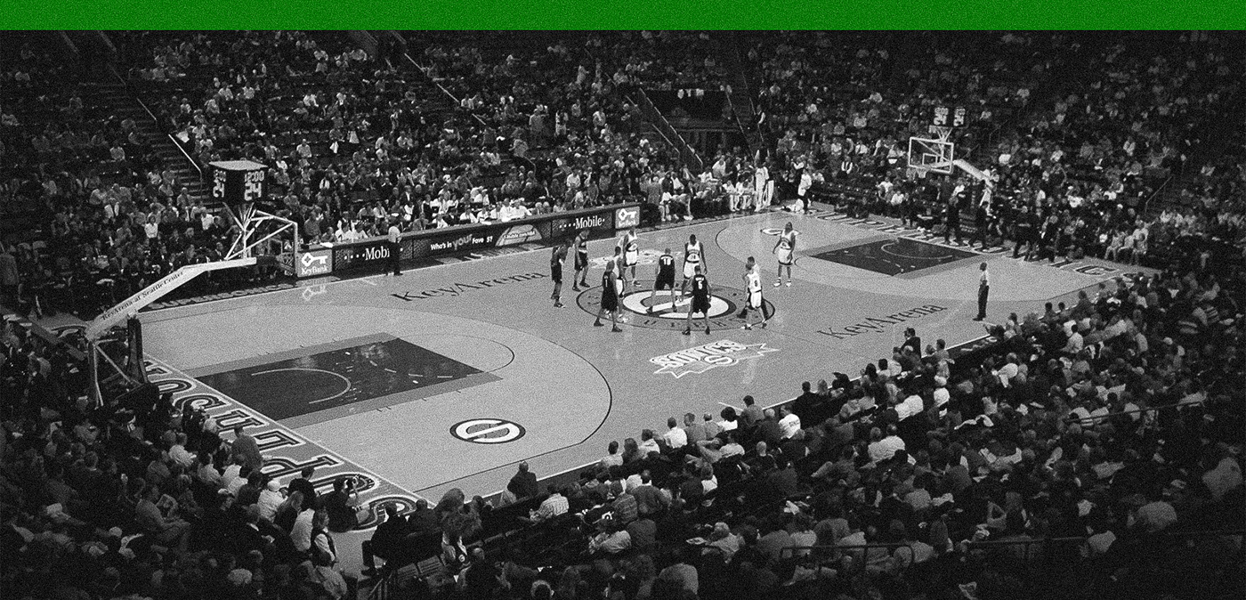
COURT
Featuring Home and City Court Designs


